5 Essential Elements Every Website Must Have
One of the first places most people will encounter your brand is through your website, but in the hustle of running a business (we get it!), websites often become an afterthought. Many websites fail to engage their users and convert them into customers due to missing critical elements.
The highest-performing websites think about their customer’s experience as a journey. They offer something of value, create an engaging experience, are easy to navigate, offer social proof, and provide a clear path forward to convert your user into a client or customer.
If it’s been a while since you took a hard look at your website, start small. Set aside a little time to consider the following 5 essential elements every website must have and set some goals for how you can improve your website in these areas. It’ll be worth it. We promise.
A Clear Value Proposition
The quickest way to get a person’s attention is to let them know what’s in it for them.
Imagine you’re talking to someone and they start telling you how good they are at advertising.
Now, imagine instead that they held up a wad of cash and said: “You could make this much money. Here’s how.”
Which one got your attention?
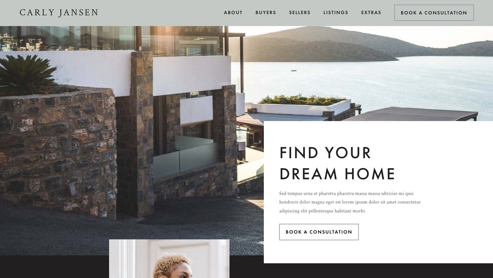
You need to present your website users with the value you can offer them as quickly as possible when they land on your website to make sure you’ve got their attention. Think for a moment: Does your site have a clear value proposition? Can they see it before they start scrolling? How big is it?
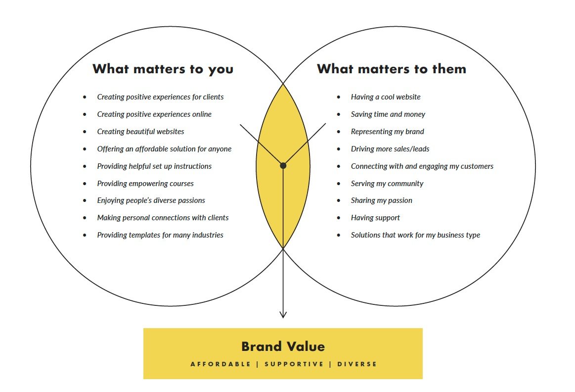
A good value proposition takes into account three main ingredients: what you offer, what your audience needs, and that magic place in the middle where they overlap.
Exploring Your Offering
Your offering is more than just the product or service—it’s everything that matters to you in the way you conduct your business.
Start by making a list of what matters to you. Be sure to consider why you got started in this business, the values you hold, the unique features of your product or service, and how you differ from your competitors.
Knowing your Audience
Start a new list. Call to mind your ideal audience. (We know, you want to appeal to everyone, but specificity about who you’re targeting will help you clarify your message and better address their concerns.) To help you focus, think about your most loyal customer or someone you know who you imagine would particularly benefit from your product or service.
Now that you have a person in mind, think about their life and what matters to them. What brings them joy? What stresses them out? What problems do they have?
Your Brand Value
Look at the two lists you just made. Is there an overlap? Do you share any values in common? What about your offering solves a problem or adds unique value for your target person? That’s your value proposition. That’s the first thing you want people to see when they come to your site. Put it into a quippy headline right at the top of your home page, and now you’re cooking with gas.
A Strong Call-to-Action
Let’s say your customer comes to your website, reads your value proposition, and they’re sold—or maybe they knew they wanted to work with you already. What should they do to move forward?
It’s absolutely essential to present a clear next step on your website to convert your website users into customers. That clear next step is called a call-to-action. Your primary call-to-action for the website should be right at the top of your home page, and you should repeat it throughout the site anywhere a potential customer is likely to be ready to take the next step. For example, if your user visits a services page, by the time they get to the bottom of that page, they may know your services are a good fit and be ready to move forward with booking an initial consultation. That’s a great place to invite your users to take action.
Some examples of primary calls-to-action include:
Start Your Free Trial
Shop Now
Subscribe Today
Book a Free Consultation
Join Us
Let’s Work Together
Inquire Now
Visit Us
Download Now
Keep it simple. Keep it clear. Use action words. Speak in your brand’s voice.
Social Proof
One of the most powerful things you can do to build trust on your website is to show that other people have found value in your product or service. This helps mitigate the perceived risk of trying your product or service, making it easier to convert your users into customers. There are lots of ways to sprinkle social proof throughout your website.
Testimonials
Testimonials are the most obvious way to show social proof. These are short blurbs from customers who recommend your product or service. It’s often a good idea to include at least a few pithy quotes from clients on your website’s home page so users scanning the site can readily see that you have happy clients.
Product Reviews
If you sell products on your website, customer reviews and ratings can encourage customers to purchase by mitigating the perceived risk.
Social Media
An active social media presence with lots of followers and engagement can also help establish the legitimacy of your brand.
Quantifiable Data
If you have any quantifiable data you can share, like “10,000 downloads and counting!” this can help customers understand how popular your product or service is. While popular doesn’t always mean better, it feels like a safer bet to customers to know that they aren’t the only person interested in your product. They may even feel a little FOMO if they don’t try it. That’s the power of the Bandwagon Effect.
Case Studies
Often people hesitate to take action because they can’t quite picture what it would mean to engage with your company. A case study is a great way to provide a complete picture of what it looks like to be your client or customer and the difference it can make. The best case studies employ qualitative and quantitative analysis to showcase the value.
Logos
There are several types of logos you can display on your site to show that you’re legit.
Media Logos — Display logos of well-known media outlets, websites, or publications that have featured your business or published your work.
Awards – Have you received any awards?
Client Logos – Showing who has worked with you can help bolster your reputation.
Partner Logos – If you partner with any organizations that might be meaningful to your audience, this can also lend legitimacy to your operation.
Be sure not to do all of the above. You don’t want your site swimming in logos that disrupt the look and feel of your brand. Choose the type of social proof that is most meaningful and impressive to your audience.
User-Friendly Navigation
For many businesses, a little attention to site structure and navigation goes a long way. If a user comes to your website and doesn’t know where to find what they are looking for, chances are you’ll lose their attention. Good navigation needs to be relevant, use clear labels, have a limited number of items, and group similar things together.
Choosing Relevant Navigation Items
The first step in making anything user-friendly is always to think like your user. Consider: what might your user want to know to feel comfortable moving forward with your primary call-to-action? What information do they need to follow through? Make a list of content and features that will facilitate them taking the desired action on your site.
Once you have the content and features identified, you’ll want to determine what pages you’ll need to accommodate that, and organize the content into pages.
Using Clear Labels
It can be fun to get creative with navigation labels, but tried and true labels like “about,” “services,” and “contact” are a wise choice because users will recognize them and have consistent expectations about the type of content they expect to find when they follow those links.
Limit Navigation Items
Too many navigation items can overwhelm users. In your primary navigation bar, more than 7 items will probably feel like too many, depending on your audience and content.
Group Similar Items Together
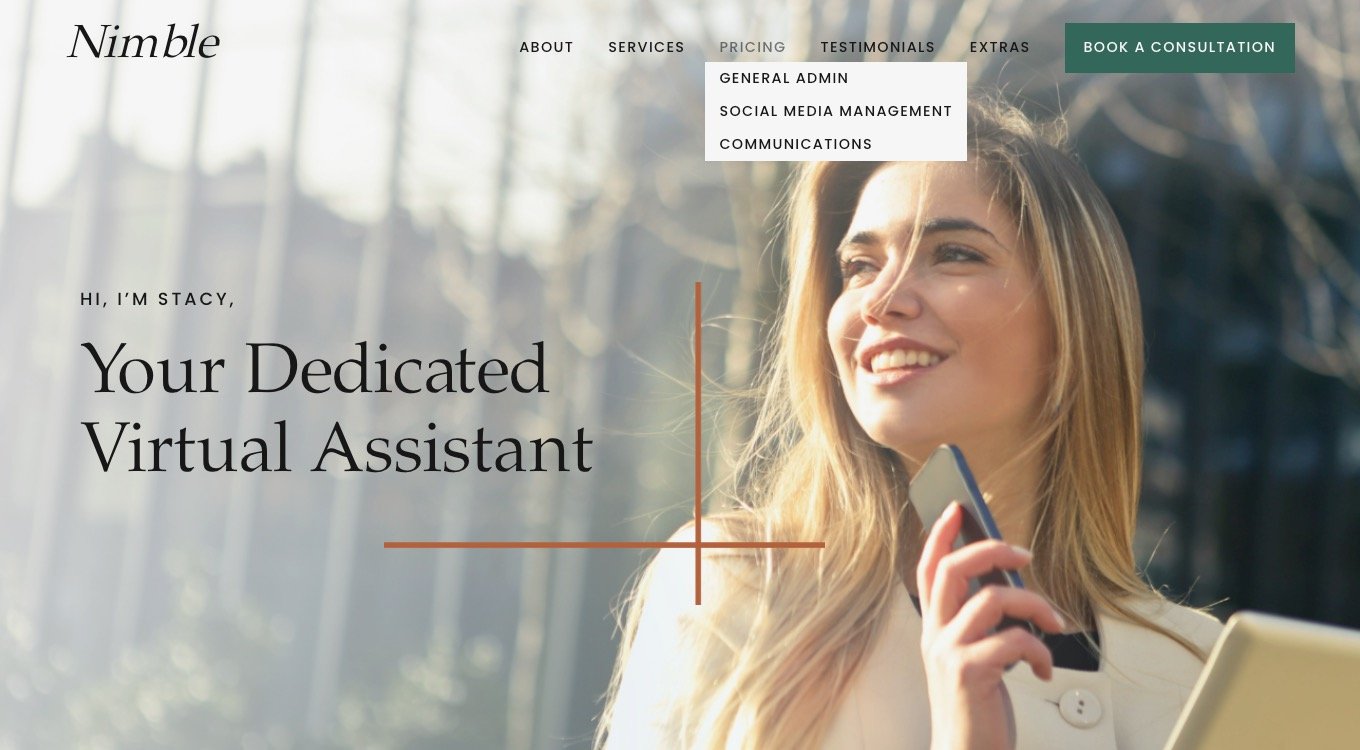
If you have way more than a few top-level pages, you may want to group similar items into a dropdown menu (folder navigation). An online shop might want to have landing pages for each category of clothing. If so, it would be wise to feature all of those pages in a dropdown menu labeled “Apparel.” A gym may want a full page for each of its classes. Those would fit well together under a “Classes” dropdown.
Test Your Navigation
The best way to know if your site navigation is user-friendly is to perform a simple user test. Ask a few people in your target audience to find something on your website and see what they do. Pay attention to where they click and where they get stuck and use that information to make it more intuitive.
Engaging Design
We know not everyone is a designer, but everyone is more than capable of attending to and improving the design of their website with attention to a few key principles.
Use Your Homepage
Your homepage is where you introduce your brand and provide users a chance to dig deeper where they may need more information. Think about all the different pages and content on your site. Summarize the most important points from those pages, break them into sections with supporting visuals, and provide links to the full pages. This is a great way to use design to teach your users the scope of your business, how to navigate your website, and give them an overview of the information they need to take action.
Use White Space
One of the most significant things you can do to get a user’s attention is to prevent them from becoming overwhelmed or distracted. Give the elements on your website plenty of room to breathe.
Keep it Brief
Everything about a good website design should work toward reducing your user’s cognitive load. Many of the things we’ve discussed here will help reduce cognitive load. Perhaps the most obvious is not making them read paragraphs of text, because—here’s the truth—they won’t. The more succinct you can be the more likely it is that your users will absorb your message without needing to hunker down and read.
Keep it Scannable
Another way to use design to ensure your users are able to effortlessly take in your message is to use clear text hierarchy. That means using headlines to break up content. If someone only reads the headlines on your website, they should be able to understand the gist of your content and properly orient themselves from that alone.
Employ Variety
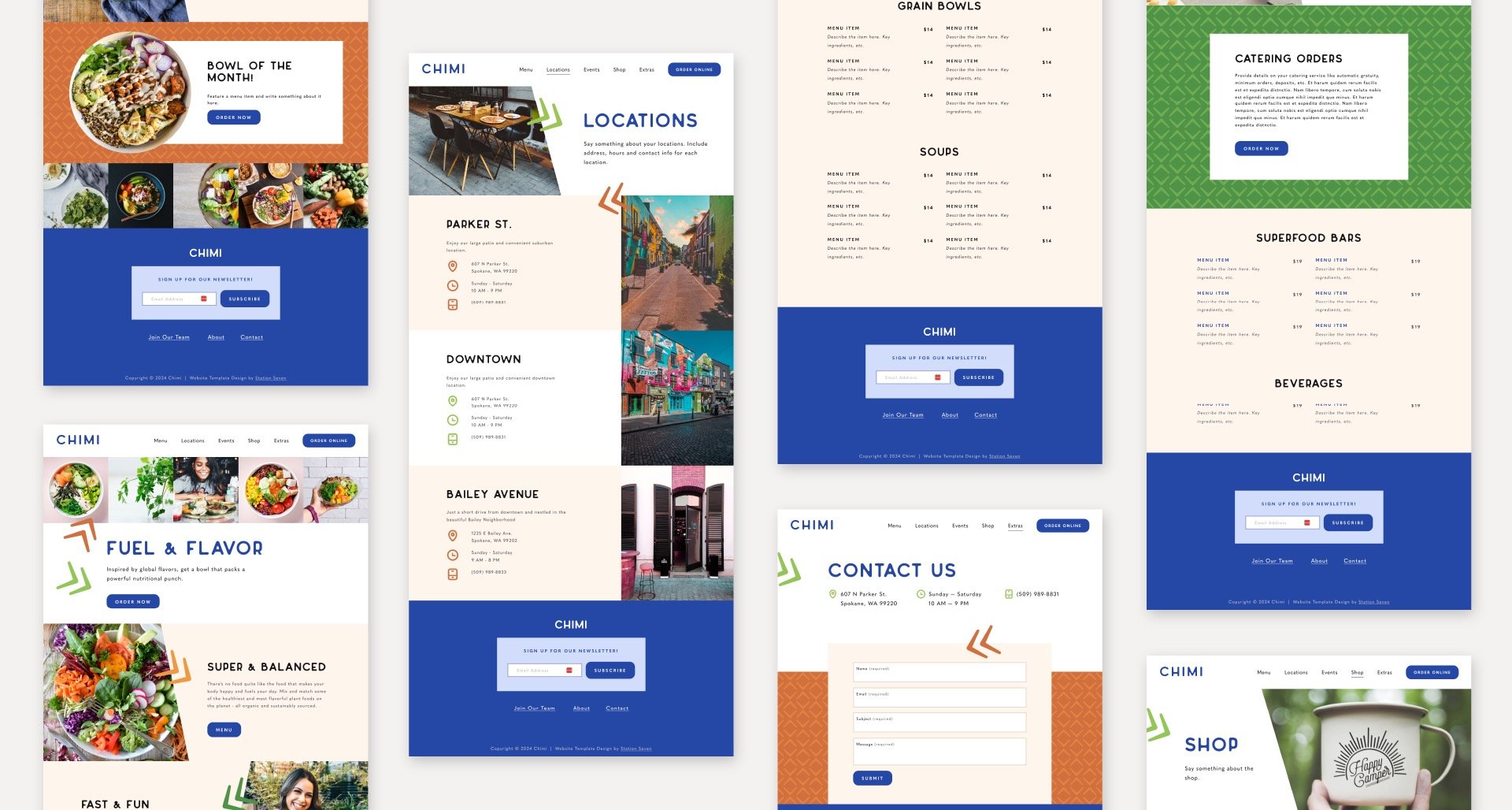
Consistency and repetition make a design feel coherent. (You wouldn’t want every button to look different, or to use more than a few colors, of course.) If every section looks the same, however, users will check out and your message will get lost. Using variety in the layouts of sections on your website will help you create visual interest.
Let’s say you start with a full-width banner section. For the next section, you may want to use a 3-column layout to showcase your core benefits side by side. After that, you may want to use a section with a solid color background and one column of text. Some sections may use images and others may be more appropriately illustrated with icons. Changing the way you mix and match layouts and brand elements will prevent your users from getting bored and help you highlight different types of content.
You’re On Your Way
Attend to each of these 5 essential elements every website must have one at a time, and improving your website can be simple. Not only is it simple, but it’s important. Your website will be the first impression most people have of your brand.
By considering and implementing these suggestions, you’ll create an online experience worthy of your business that draws in potential clients or customers, captures their interest, and inspires them to take action.


